Market analysis is a method of understanding the constantly evolving competitive marketplace. One way to scrutinize these patterns and track progress is to adopt bubble charts. These visual representations offer a unique way to analyze multi-dimensional data. Below, we introduce the ins and outs of bubble charts for market analysis.
Understanding Bubble Charts
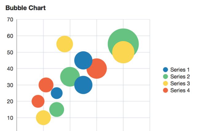
In its most simplified form, a bubble chart is a variation of a scatter plot. The core difference is that it incorporates a third variable displayed as the size of the bubbles on the chart.
A common use for bubble charts comes into play for presenting financial data. These charts allow for visualization of investments, showing the relationship between risk, return, and volume of investments. They are also adept at conveying information across different dimensions simultaneously. You can analyze and compare complex data in a visually intuitive manner, facilitating better decision-making.
The art of effective bubble chart interpretation requires an in-depth understanding of the data points. They are especially useful when working with a high volume of big data. Bubble charts provide a sophisticated yet simple visualization that allows companies to draw meaningful interpretations from data, aiding in decision-making processes.
Key Components When Creating Bubble Charts for Market Analysis
A well-constructed bubble chart for market analysis is composed of several essential elements. The most fundamental components are the axes, which represent variable categories on the horizontal and vertical planes.
Then comes the size of the individual bubbles. The bubble’s magnitude signifies the proportion of another variable, enabling a three-dimensional analysis in a two-dimensional representation. Additionally, using colors for different categories of bubbles brings out the comparative elements that might be lost in monochrome. This color-coding further enhances the understanding by differentiating bubble groups.
Lastly, the placement of the bubbles shows the relationships and correlations between the variables. With these components in mind, market analysis can achieve a whole new layer of insights.
How Bubble Charts Elevate Market Analysis and Uncover Hidden Opportunities
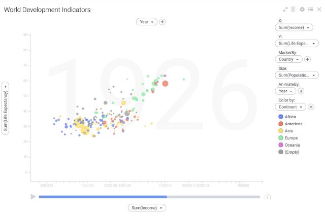
Bubble charts share a unique space in the field of market analysis. They are equipped to present a complex set of data in an easily digestible form, making them a valuable resource for financial analysts, marketers, and strategists. The ability to illustrate three or four distinct variables simultaneously aids in streamlining data-informed decision-making processes.
In the context of market analysis, bubble charts can easily map market share and growth rates concurrently. The granular details enable trend-spotting, leading to the revelation of potential unseen opportunities or underperforming aspects of the market.
The comparative analysis through bubble charts aids in identifying outliers, contributing factors, and shifts in your market. They simplify the data, transforming raw facts into actionable information.
By addressing all these points, it’s evident that bubble charts do not just offer visualization. They guide companies toward valuable insights that might have slipped through a standard analytical process.
Practical Applications of Bubble Charts

Bubble charts assist in unveiling the big picture of market dynamics across multiple industries. In a typical market scenario, a company can use bubble charts to track product performance over time.
In the field of finance, analysts utilize bubble charts to juggle return on investment, risk, and volume of investment simultaneously. Such visualization helps determine the optimum asset allocation.
Bubble charts also find use in social media analytics. You can monitor the popularity and influence of a topic or content, correlating them with the time or other parameters.
Irrespective of the scenario, bubble charts offer a unique advantage in terms of clarifying data patterns and their underlying implications for strategizing and decision-making processes.
Mastering the Art of Bubble Chart Analysis
Bubble chart interpretation starts with understanding your axes. Knowing what each axis represents is critical in understanding an outline. Then, identify the larger bubbles first as they signify a larger impact on the data set.
Remember to take color codes into account. Different colors often represent varying categories or subjects. Don’t merely focus on one attribute; look for relationships and interactions across multiple dimensions.
Look for clusters or groupings. They often indicate patterns or relationships within the data. Identifying these clusters will lead you to uncover hidden opportunities.
Lastly, consider the position of the bubbles. If high-value metrics are positioned closer to the desired quadrant, it represents a successful strategy or positive performance.
Overall, bubble charts are an indispensable tool for insightful market analysis. They offer a multitude of benefits, including identifying hidden opportunities and forecasting future trends.


Leave a Comment